
You have heard the saying “never judge a book by its cover.” But readers do — every single time. Research consistently shows that a book's cover is the single most influential factor in a purchasing decision, both in physical bookstores and on digital retail platforms. Understanding why design matters for book sales is not a vanity consideration; it is a commercial and creative imperative for every serious author.
The Psychology of Book Cover Design
A reader browsing Amazon India or a bookshop shelf makes a cover assessment in under two seconds. In that window, they decide whether to look closer or scroll past. This is not superficial — it is a deeply rational shortcut. A well-designed cover communicates genre, tone, audience, and quality instantly, saving the reader the time of reading the blurb to discover the same information.
What a Cover Communicates at a Glance
- Genre: A dark, foreboding cover with bold typography signals thriller. A watercolour illustration with flowing script signals romance. A minimalist design with a single symbolic object signals literary fiction. Readers use these visual codes fluently
- Target audience: Typography weight, illustration style, and colour palette all communicate whether a book is for children, young adults, or adult readers
- Quality of production: A professional, well-designed cover signals that the book inside is likely to be of comparable quality. A poorly designed cover creates immediate doubt about the author's professionalism and the book's content
- Emotional promise: The best covers do not just categorise — they create an emotional anticipation that makes the reader want to experience what is inside
In the age of digital bookselling, your cover must work at thumbnail size — approximately 100x150 pixels on a mobile screen. If your title is unreadable at thumbnail size, or the image becomes muddy and unidentifiable, your cover is failing at the most important point of sale. Always test your design at thumbnail before approving it.
The Elements of an Effective Book Cover
Great book cover design is not about making something beautiful — it is about making something that converts browsers into buyers within your specific genre and audience. Every element must work together with purposeful intent.
Typography
Font choice is one of the most powerful and most commonly mishandled elements of book cover design. The wrong font immediately signals to genre-savvy readers that the cover was not designed by a professional. Serif fonts convey tradition, authority, and literary weight. Sans-serif fonts suggest modernity and accessibility. Script fonts suggest romance and femininity. Distressed or grungy fonts suggest horror or dark thriller. Choose fonts that are already working in your genre's bestseller covers.
Colour Palette
Colour carries enormous psychological weight. Red conveys danger, passion, and urgency — it dominates thriller and romance covers. Blue conveys calm, intelligence, and melancholy — common in literary fiction and memoir. Black and gold signals luxury and prestige — popular in premium non-fiction. Bright, high-contrast colours attract children and young adult readers. Study the colour conventions of your genre's bestsellers and make deliberate choices about where to conform and where to differentiate.
Imagery
The central image or illustration on your cover must do two things simultaneously: communicate genre clearly and create intrigue. A face with averted eyes creates mystery. An atmospheric landscape establishes a sense of place. An abstract symbolic object invites interpretation. For Indian authors, culturally resonant imagery — a sari, a rangoli pattern, a specific architectural detail — can powerfully differentiate your cover from international competition while signalling the book's cultural context.
Hierarchy and Composition
The three elements that must be most legible on a cover are: your title, your name, and the central image — in that priority order (unless you are a globally famous author, in which case your name comes first). Everything else must support these three elements without competing with them. Clean hierarchy is the difference between a professional cover and an amateurish one.
Amazon's algorithm factors in your book's click-through rate from search results — which is largely driven by your cover. A better cover does not just sell more books directly; it improves your discoverability ranking, creating a compounding benefit over time.
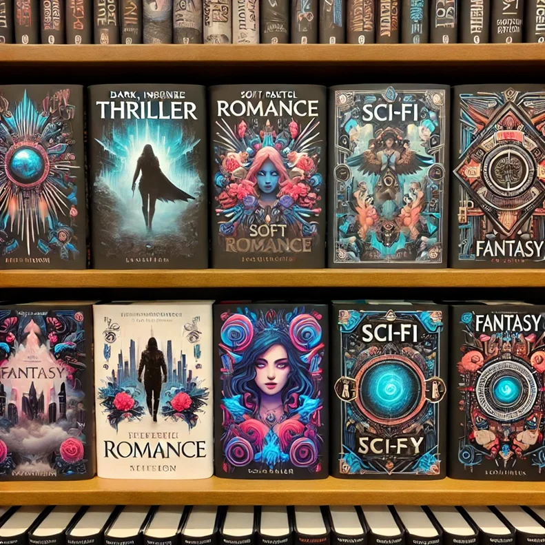
Genre-Specific Cover Design Conventions
Each genre has visual conventions that readers have been conditioned to recognise. Breaking these conventions is risky — it confuses buyers and reduces click-throughs. Understanding them is essential.
Thriller & Crime
Dark backgrounds. Bold, heavy typography often in white or red. Shadowy figures, empty streets, or single ominous objects. High contrast. The overall effect should feel threatening and urgent.
Romance
Warm colour palettes (pinks, golds, reds). Couples or single figures in evocative poses. Script or elegant serif typography. The cover should feel emotionally warm and promise connection.
Literary Fiction
Often more abstract and artistic. Symbolic imagery, painterly illustration, or striking photography. Elegant typography. The cover signals intellectual and aesthetic ambition rather than genre escapism.
Self-Help / Non-Fiction
Clean, uncluttered design. Strong author photo often featured. Bold, benefits-focused title typography. Professional and authoritative feeling. Subtitle that explains the book's promise clearly.
How to Get a Professional Cover Design
For most authors, cover design is the single most important investment they can make in their book's commercial success. Here are your options, from budget to premium.
- Hire a professional book cover designer (Rs. 5,000–50,000+): The best option for serious authors. Platforms like Reedsy connect you with vetted book cover designers with genre expertise. Always review a designer's portfolio specifically for your genre before hiring
- Pre-made cover services (Rs. 2,000–10,000): Many designers offer pre-made covers that can be customised with your title and author name. These are professionally designed and genre-appropriate, at a fraction of bespoke design cost
- Design platforms (Free–Rs. 3,000/year): Canva, Adobe Express, and Visme offer book cover templates. These can produce acceptable results if you have a design eye and study genre conventions carefully. Not recommended for authors without any design background
- Publisher-provided design: Traditional publishers and full-service self-publishing companies like True Sign Publishing House include professional cover design as part of their publishing package
Before briefing a designer, compile a mood board of 10–15 covers from bestselling books in your genre that you love and that represent the tone of your book. A well-prepared brief gets you a better cover faster, and saves revision rounds — which typically cost money or time.
Testing Your Cover Before You Commit
Never finalise a cover without testing it with real readers. Their reactions will tell you things no amount of self-assessment can reveal.
- Pickfu or Facebook polls: A/B test two cover options with real readers in your target demographic. Even a small sample of 50–100 opinions can reveal which cover performs better before you commit
- Genre reader feedback: Share your cover in reader groups specific to your genre on Facebook, Reddit, or Goodreads. Genre readers will tell you immediately whether the cover communicates the right signals
- Thumbnail test: Resize your cover to 100x150 pixels and check that the title is readable and the key image is still clear and compelling
- Print vs digital check: If you are printing physical copies, always request a physical proof. Colours on screen look different in print — particularly dark covers, which often look muddy in lower-quality print runs
Your Cover Is Your Book's First and Most Important Sentence
No matter how brilliant your writing is, if your cover does not communicate your book's genre, quality, and promise in under two seconds, most potential readers will never discover it. In a market where millions of books compete for attention every day, a professional, genre-savvy cover is not a luxury — it is a basic requirement for commercial success.
At True Sign Publishing House, every book we publish receives a professionally designed cover crafted specifically for its genre and target audience. Because we believe your story deserves to be seen — and a great cover is how that journey begins.
Write a great book. Give it a cover that does it justice. Watch readers find it.
Frequently Asked Questions
Professional book cover design in India typically costs between Rs. 5,000 and Rs. 50,000 depending on the complexity of the design, the experience of the designer, and whether illustration or photography is required. Pre-made cover services offer professionally designed covers for Rs. 2,000–10,000. Full-service publishing companies like True Sign Publishing House include cover design as part of their publishing packages.
Yes, but it requires both design skill and deep knowledge of your genre's visual conventions. Tools like Canva and Adobe Express make the technical process accessible. However, the most common self-publishing mistake is a self-designed cover that looks amateur to genre readers, significantly reducing sales. If you are serious about commercial success, investing in a professional designer is strongly recommended.
Dramatically and measurably. Self-published authors who have split-tested their covers consistently report 20–200% improvement in click-through rates and conversion with a better cover. On Amazon India, where most book discovery happens through search and recommendation, your cover thumbnail is often the only marketing asset a potential reader sees before deciding whether to look further. Cover design is arguably the highest-ROI investment a self-published author can make.
Blog Comments